
Blue Farm
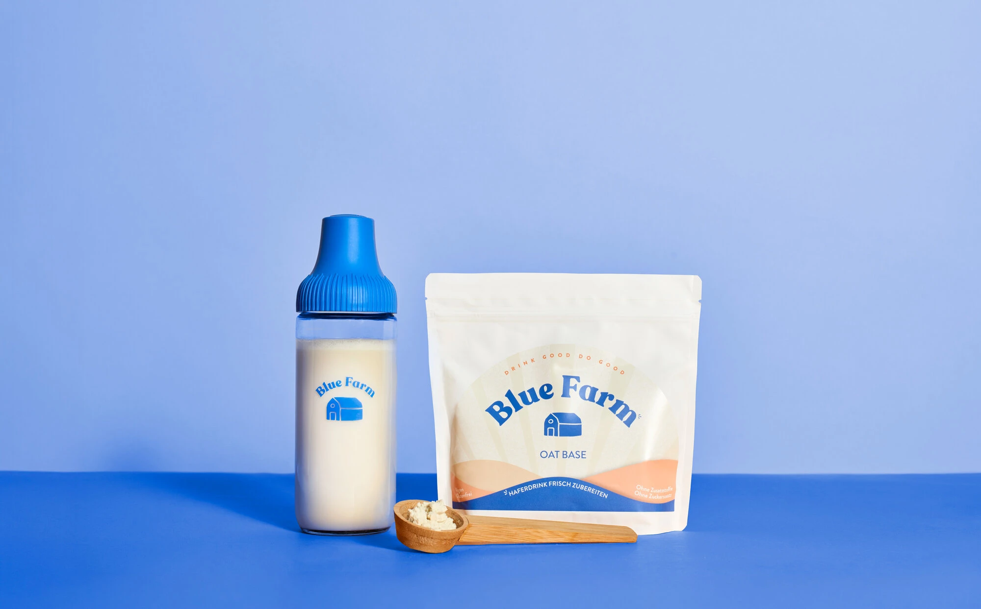
A contemporary plant-based wellness brand rethinking everyday nutrition through sustainable oat-based drinks, combining natural simplicity with a refined and sensory-driven visual identity.
CHALLENGE
Building a more emotionally driven brand experience around sustainability and plant-based living, translating functional product benefits into a calm, contemporary and visually engaging narrative.
APPROACH TO THE PROJECT
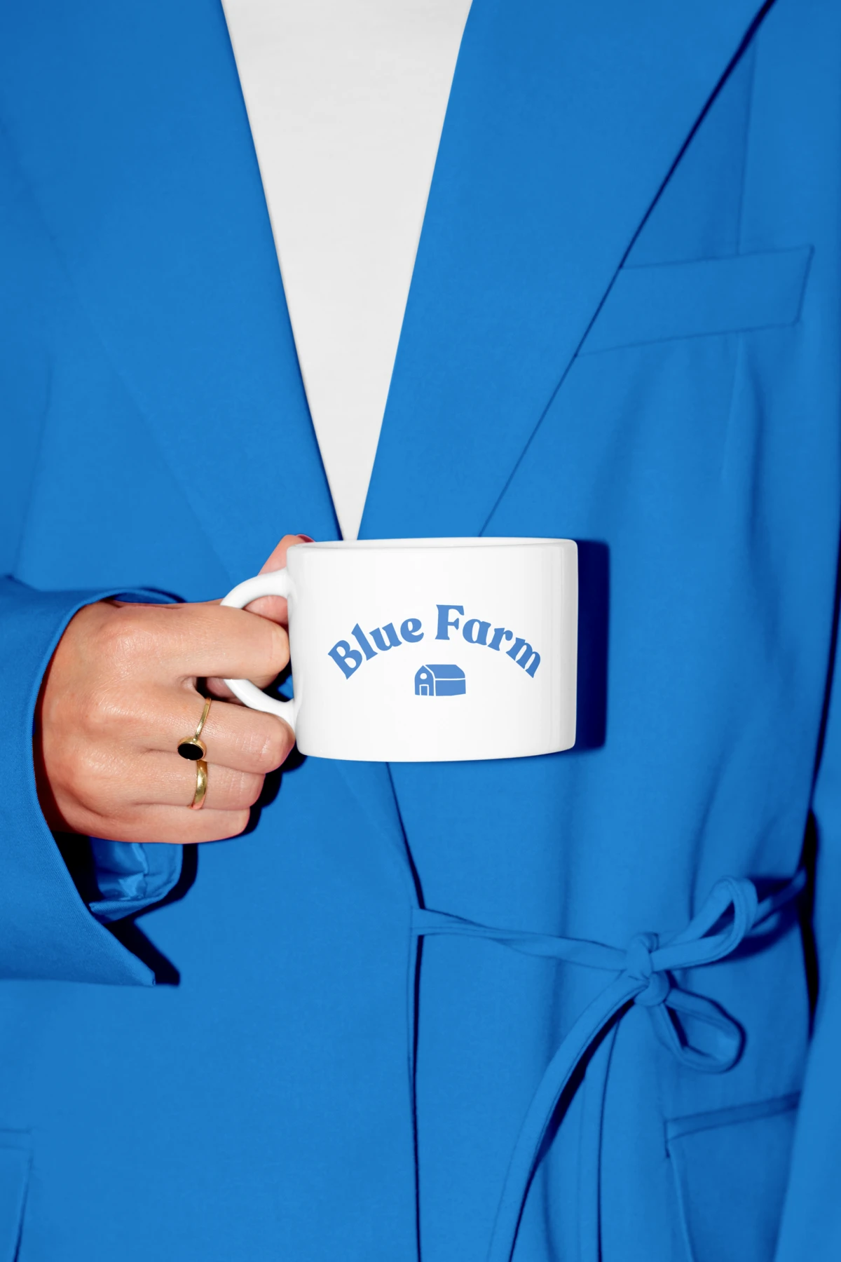
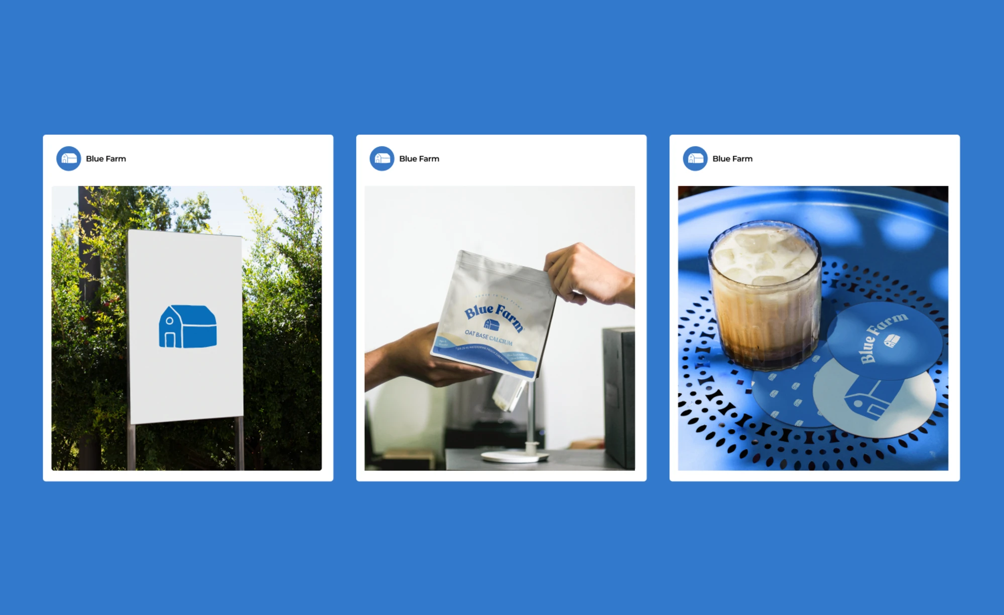
Everyday Rituals.
A lifestyle-driven visual direction balancing tactile compositions, editorial minimalism and contemporary wellness storytelling.
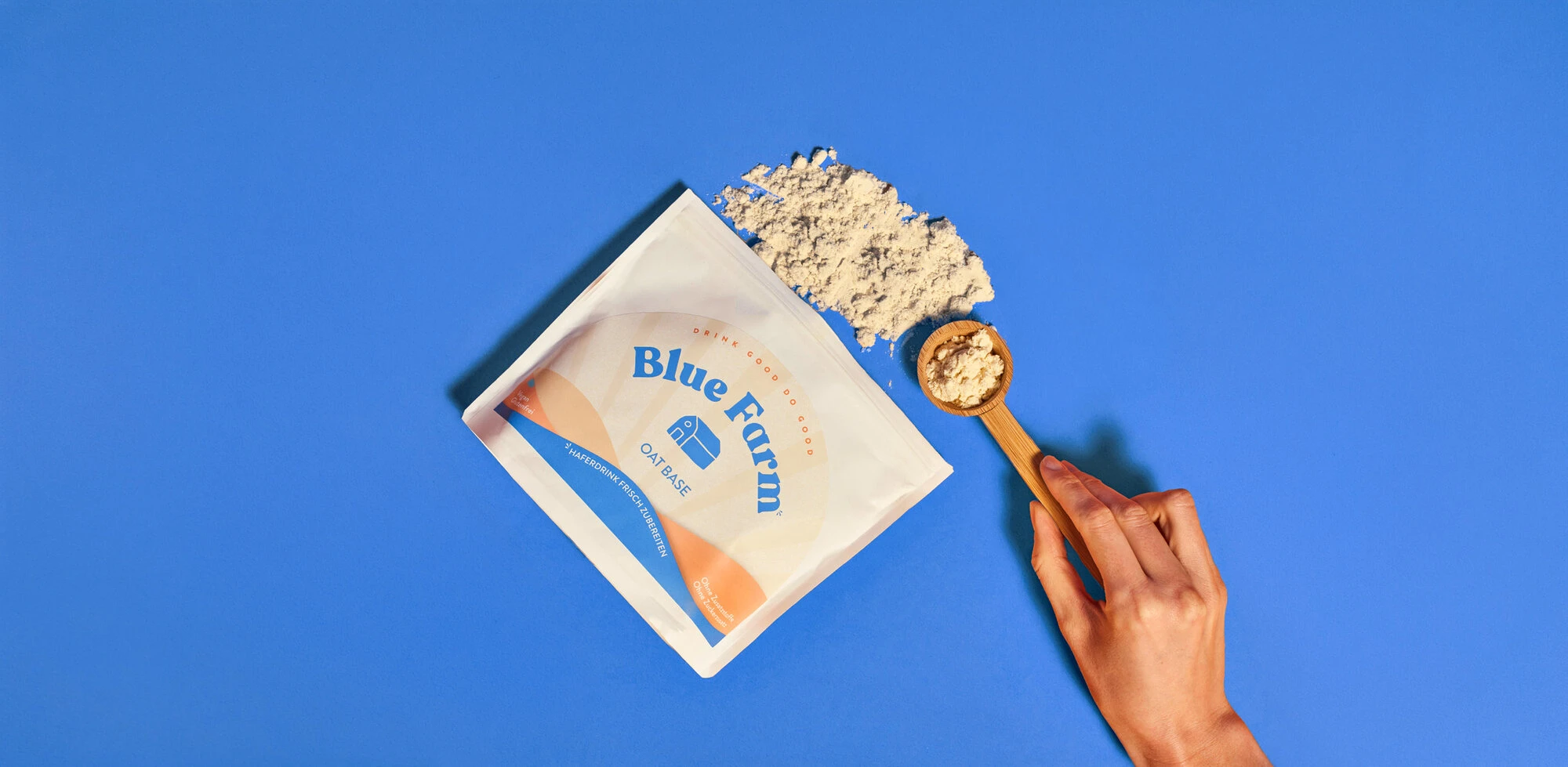

Us vs. Them.
A direct, visually striking comparison strategy designed to contrast Blue Farm’s pure, powder-to-milk simplicity against traditional carton alternatives, highlighting consumer value without losing editorial sophistication.
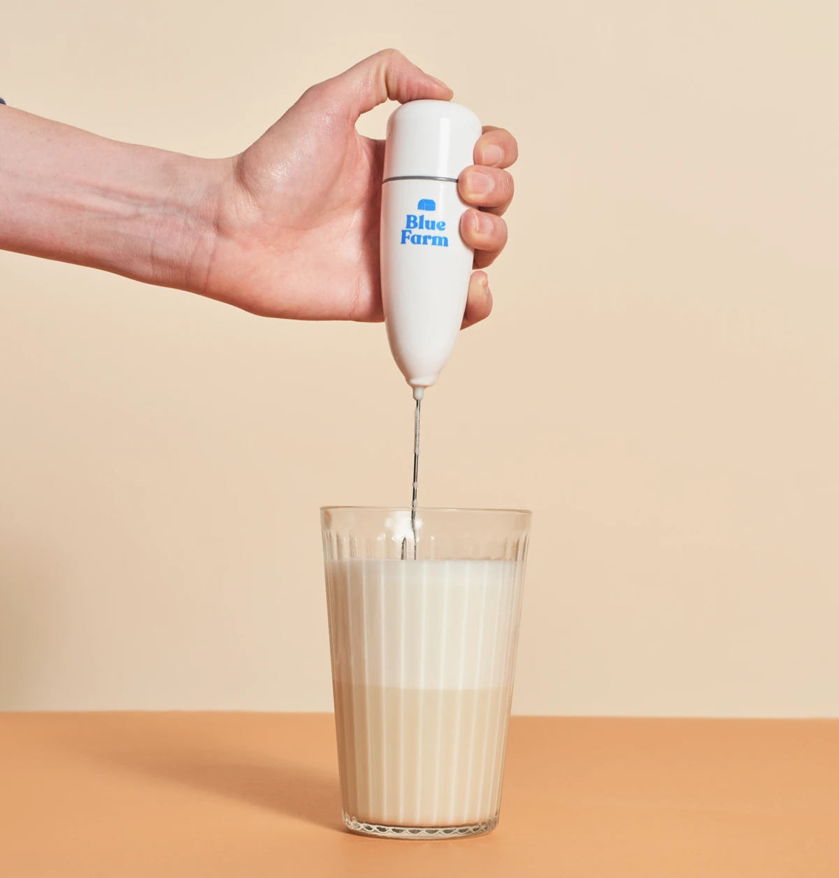
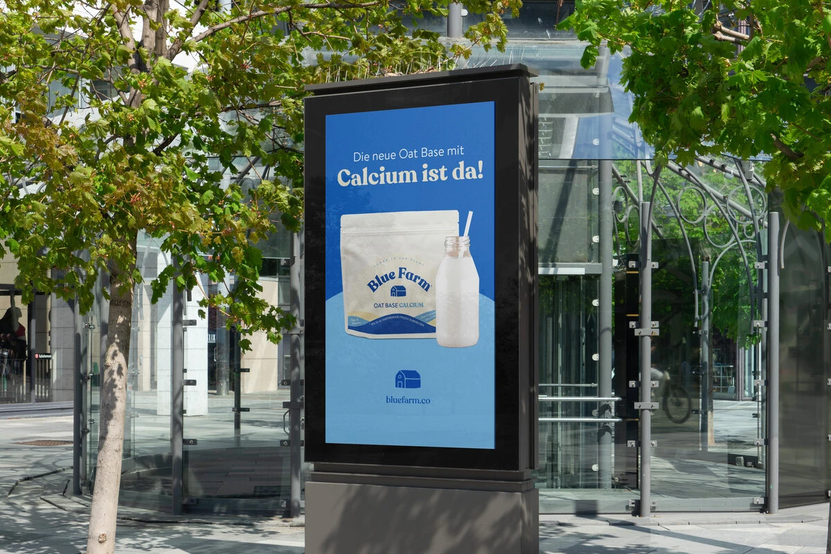
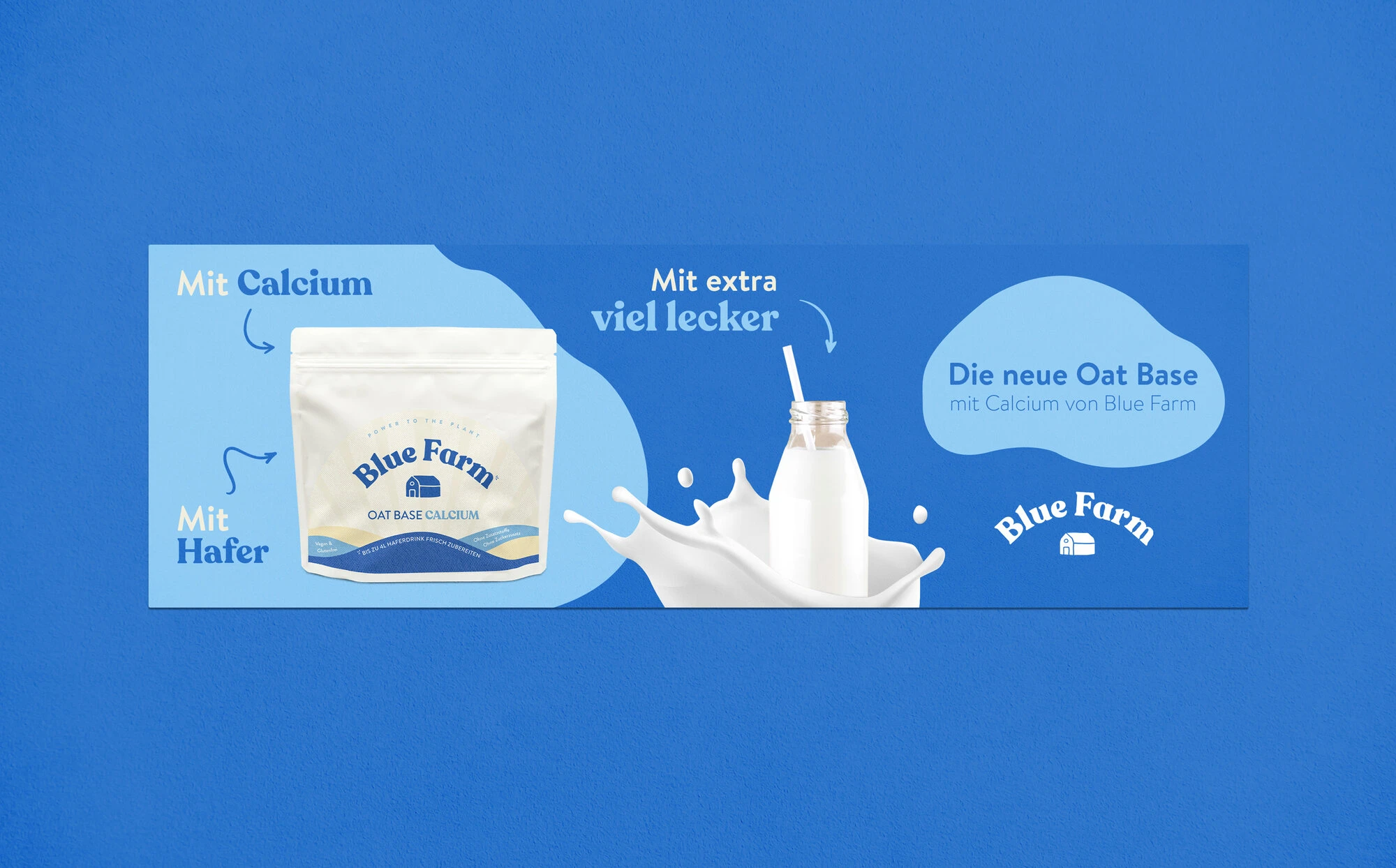
The Calcium Benefit.
Translating nutritional value into a refined visual narrative. This campaign focuses on the health benefits of fortified oat milk, utilizing bold typography and clean grids to deliver functional clarity at a single glance.
Less Waste.
Amplifying the brand’s core eco-conscious message through high-contrast design. A digital-first campaign highlighting the environmental advantages of reducing packaging waste.